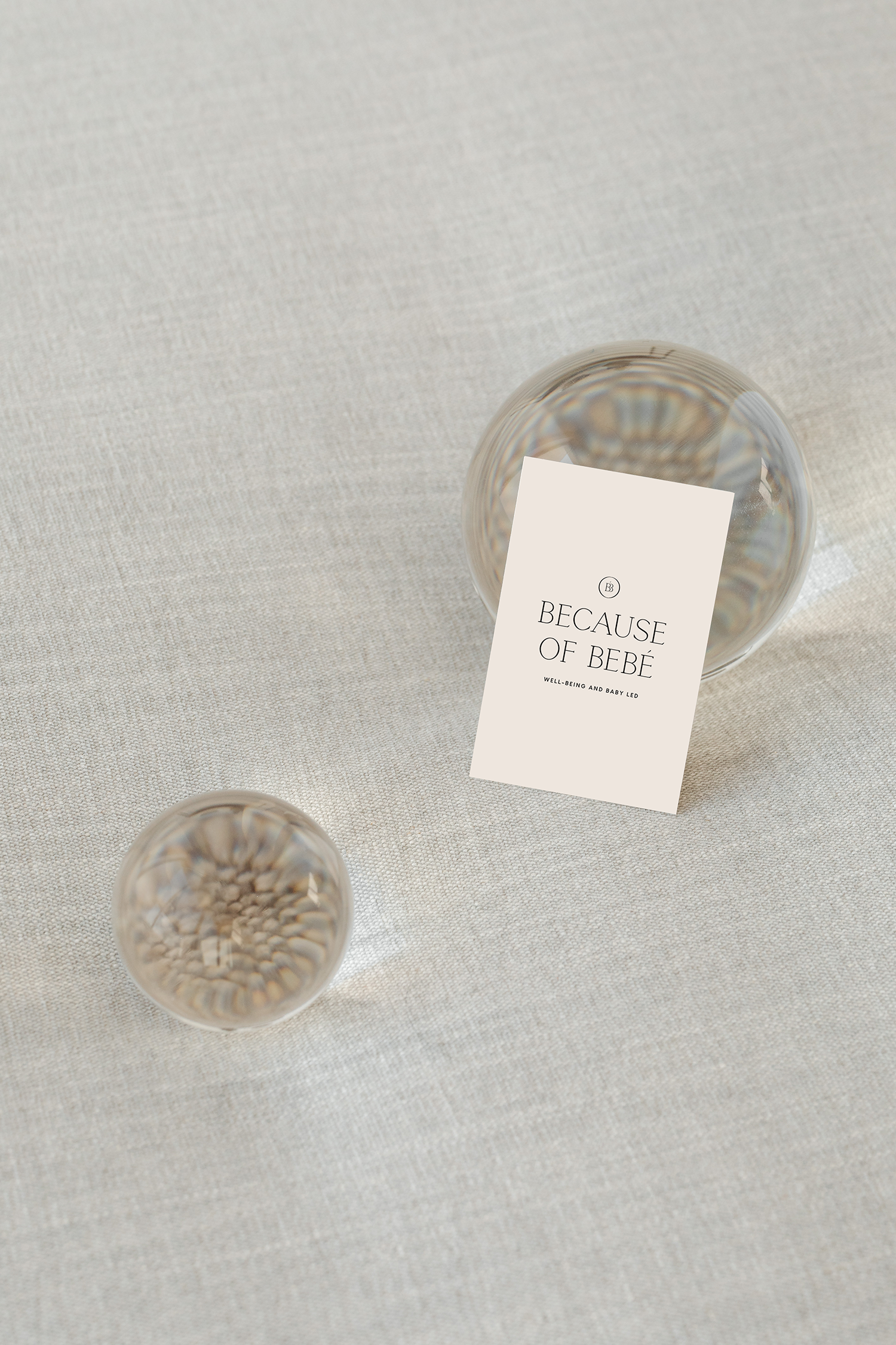
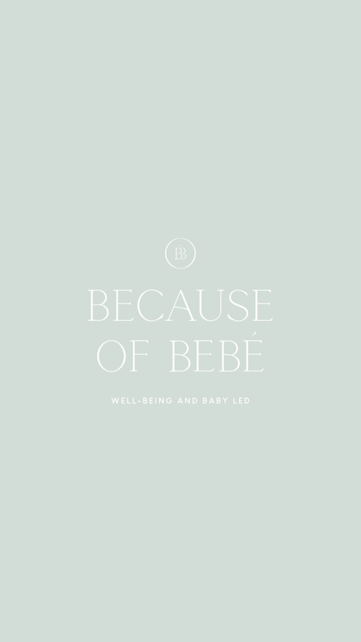
Because of Bebé

THE OBJECTIVE
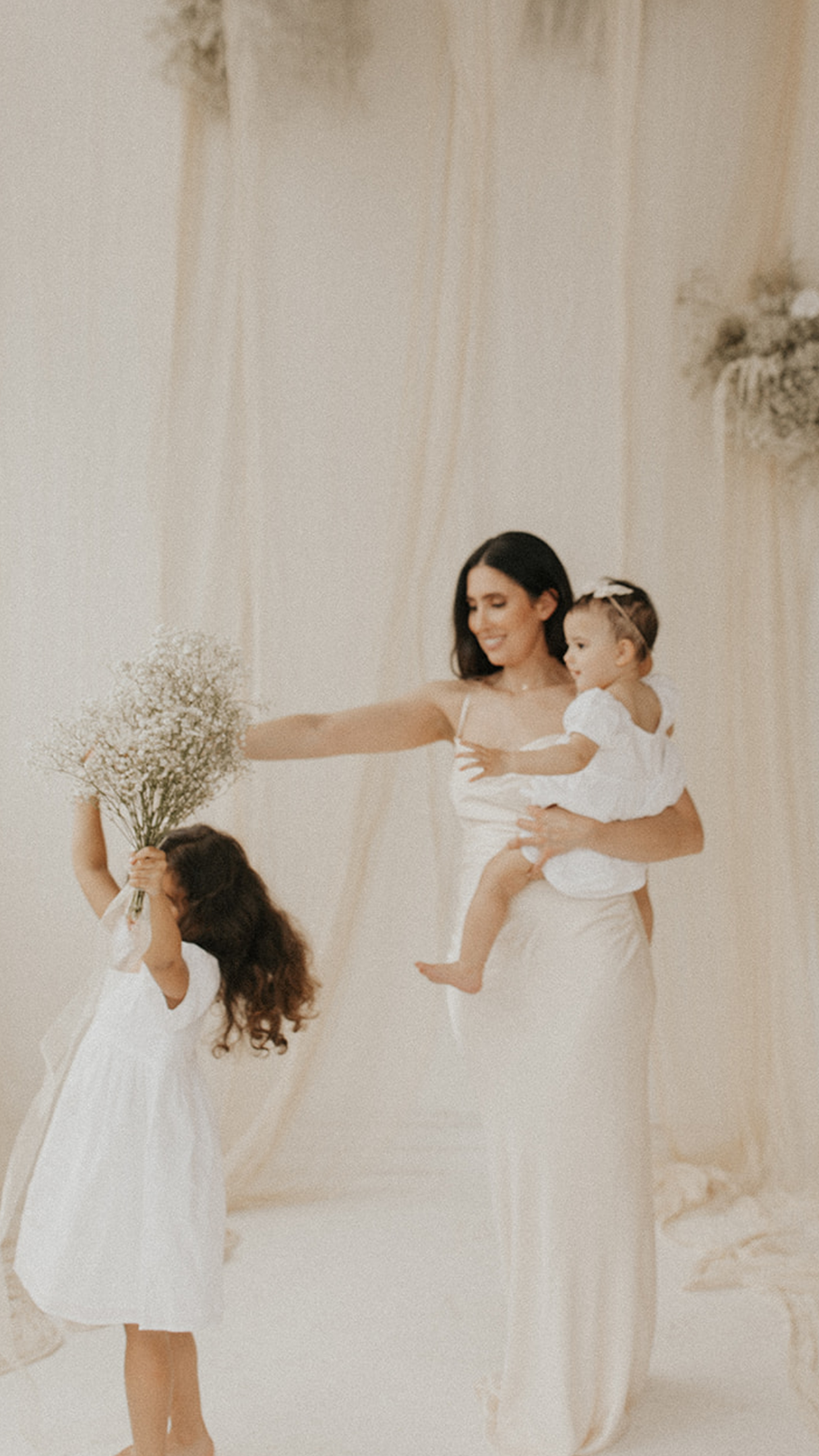
Because of Bebé is a well-being and baby led brand helping to bring confidence, attachment, and dependence back into homes through the way mothers parent their little ones. The brand essence we created is effortless and simple, but at the same time, exhibits stability and authenticity, alluding to the brand’s intentional services for mothers and their babies. From combining modern and elegant, timeless typography, to the use of pastels and natural tones, it’s a feeling of traditional meets new for this modern baby brand.
CLIENT INDUSTRY: BABY + WELLNESS

DESIGN NOTE
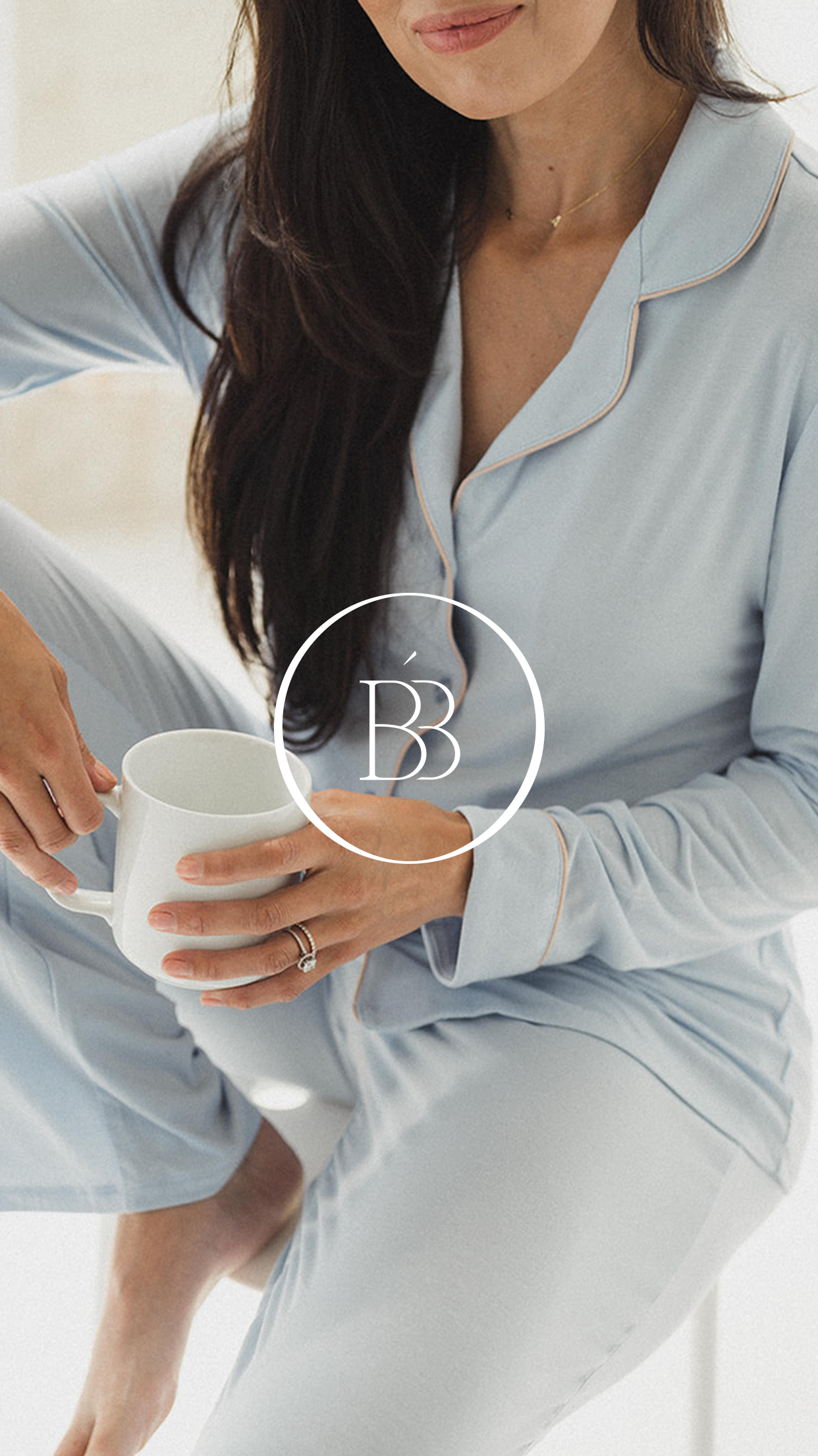
The two B’s in the brand mark side by side are alluding to the words “Because” and “Bebé”. But the shape of them showcases an illustration of a woman’s pregnant body, representing motherhood without being too on-the-nose. Lastly, having not one but two B silhouette’s of a women’s pregnant body side by side exhibits the brand’s idea of not going through motherhood alone. In other words, the community and support that the Because of Bebé brand provides.
WATCH ME DESIGN THE LOGO