Ettafoto

THE OBJECTIVE
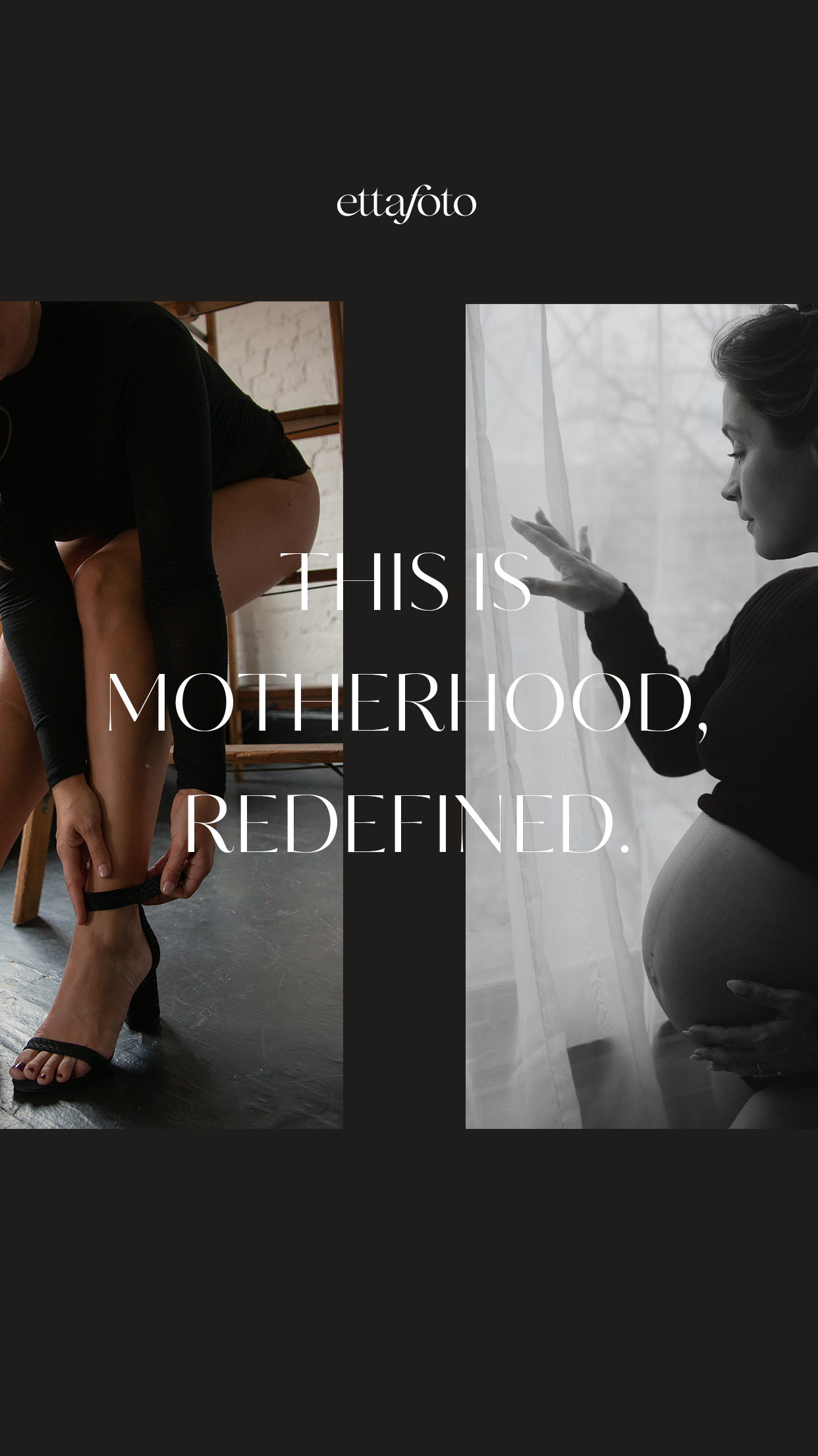
For this full branding and a website in a week project, our goal was to create a brand essence that combines Ettafoto’s empowering, feminine signature style of photography with one that can attract the ideal clients she wants to work with - mothers who want to embody more of their divine feminine.
With the use of both modern and elegant typography, a minimal, BW color palette with a pop of mauve, and an editorial style website layout, we were able to emulate an authentic and aligned brand experience. One that allows space for her powerful photography to shine and for her ideal clients to see themselves in her work and essence.
CLIENT INDUSTRY: PHOTOGRAPHY
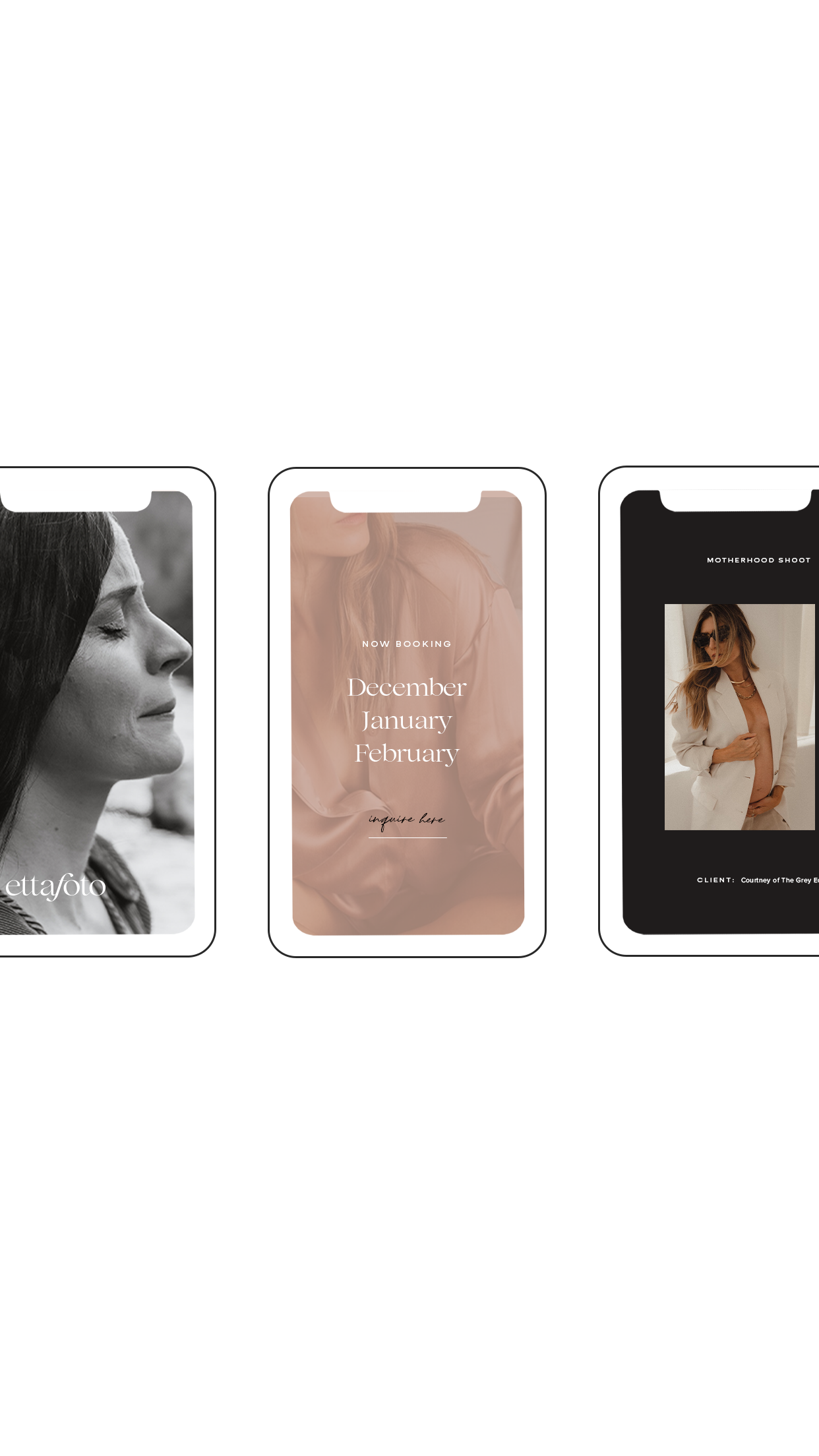
WEBSITE PLATFORM: SQUARESPACE

DESIGN NOTE
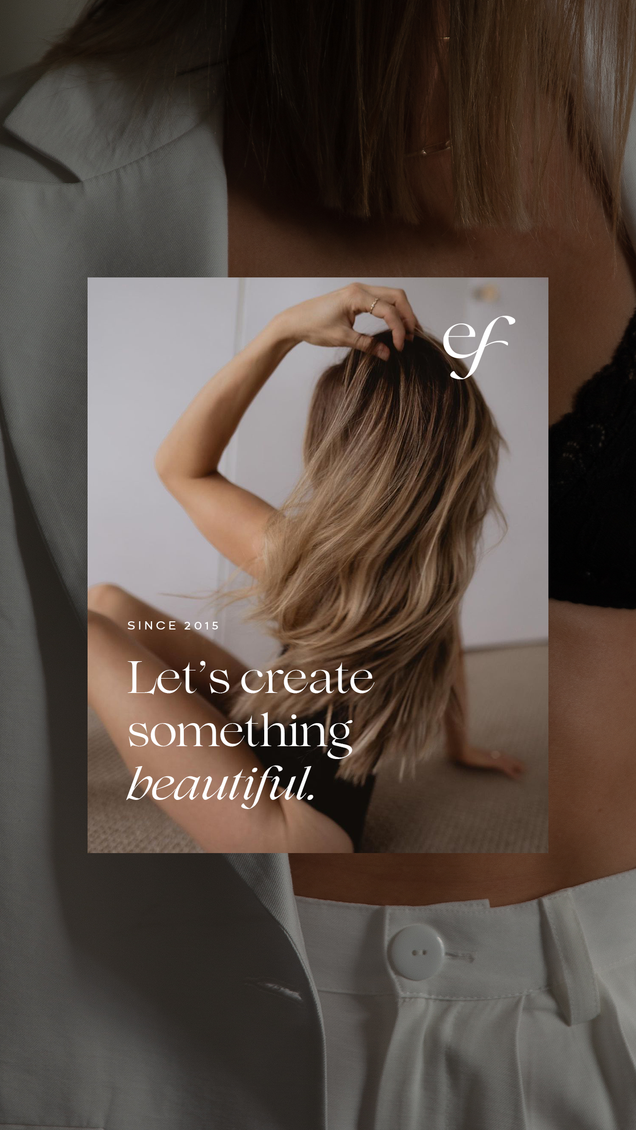
The primary logo is illuminates the elegance and boldness of the brand, but at the same time creates a sense of stability and authenticity. This alludes to the brand’s intentional services for real, raw, and beautiful motherhood photography. The brand mark plays with a more abstract and fluid look to allude to the feminine mystique of the brand’s essence and mission for mothers.
WATCH ME DESIGN THE LOGOS