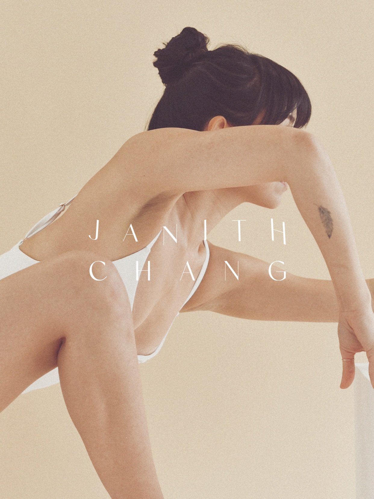
Janith Chang

THE OBJECTIVE
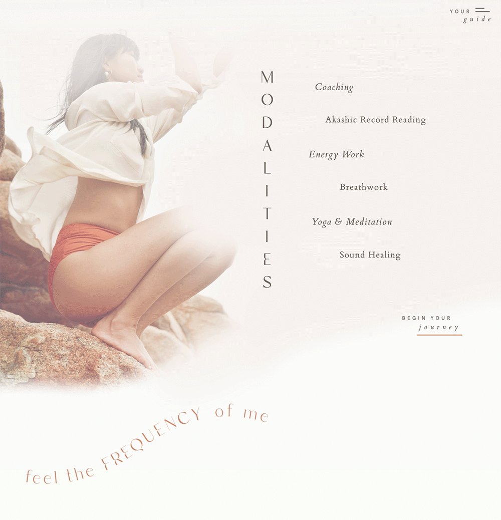
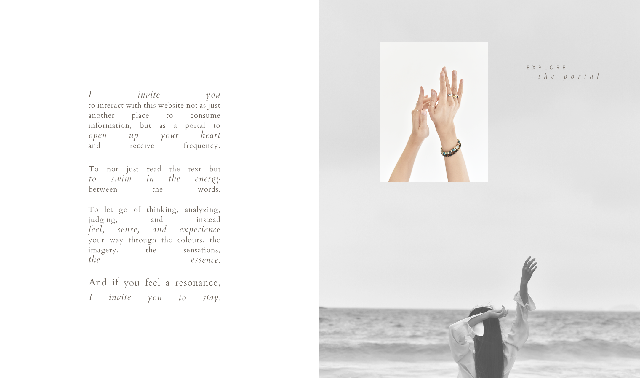
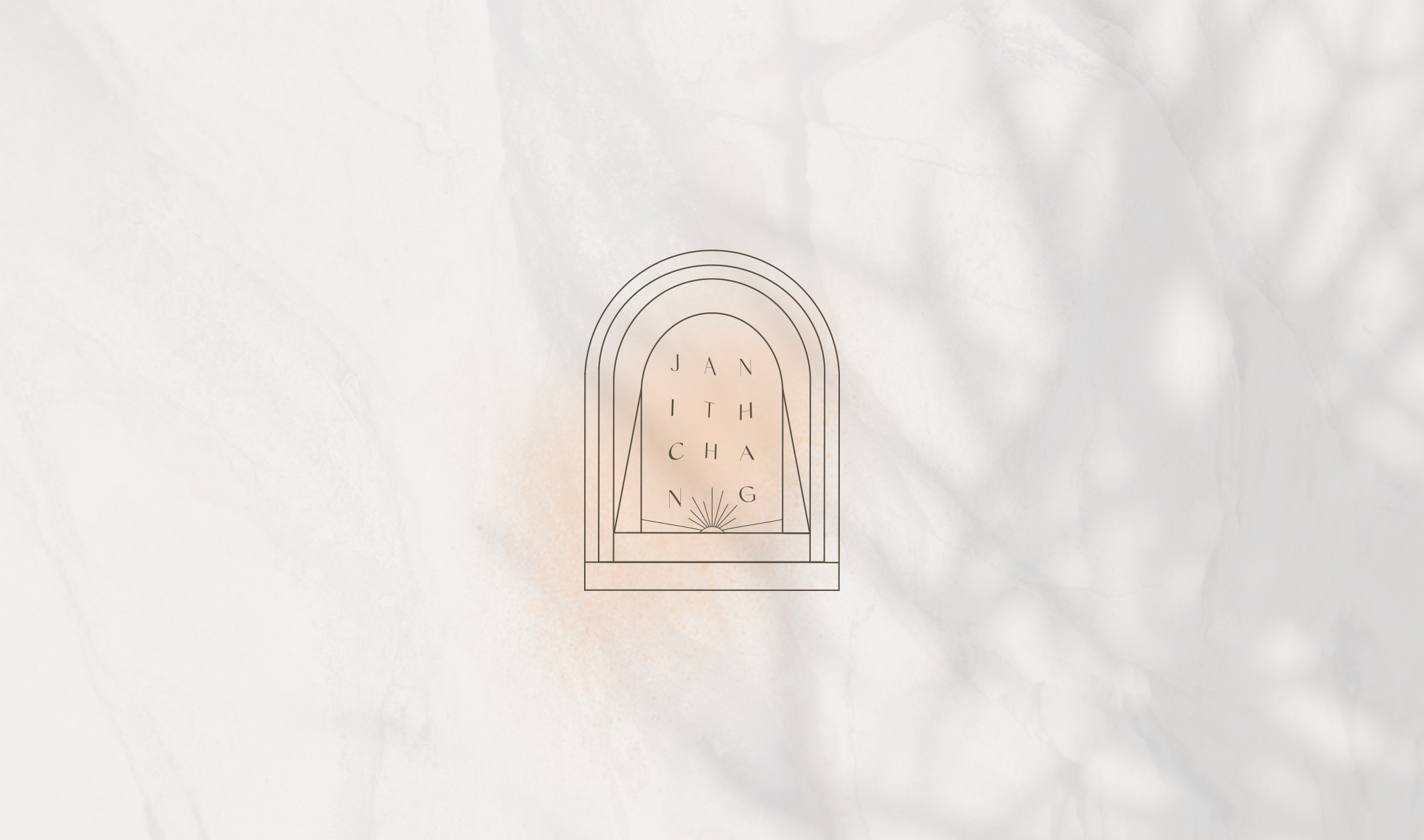
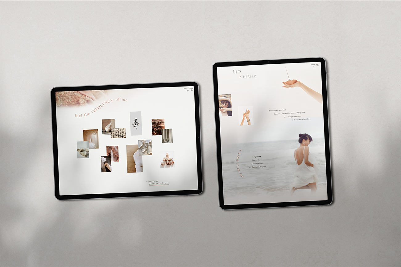
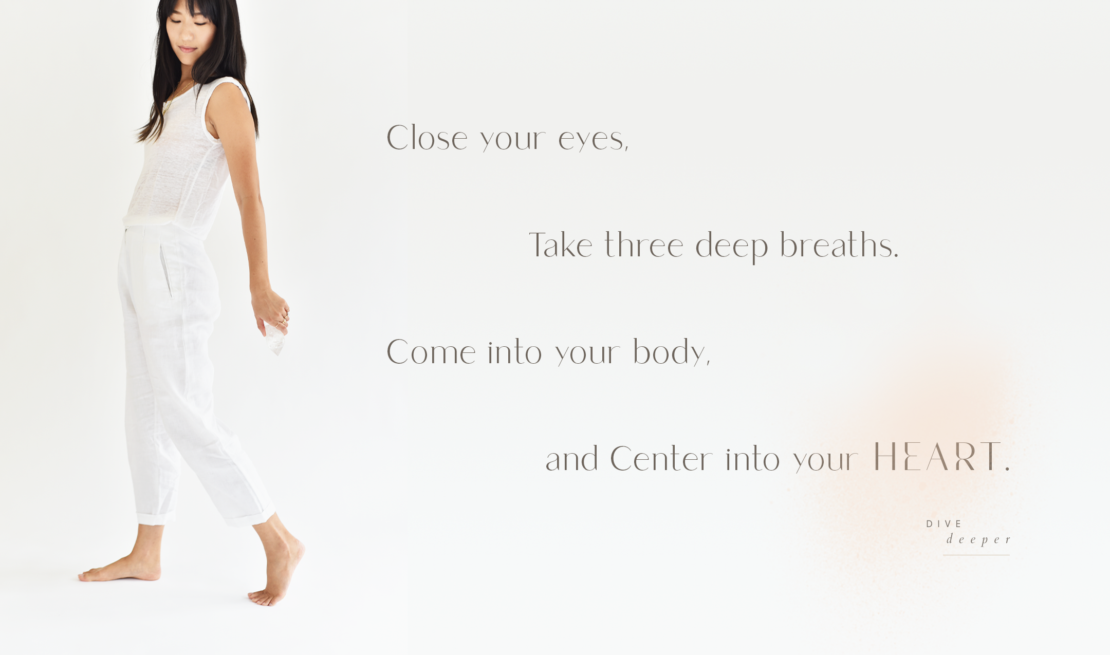
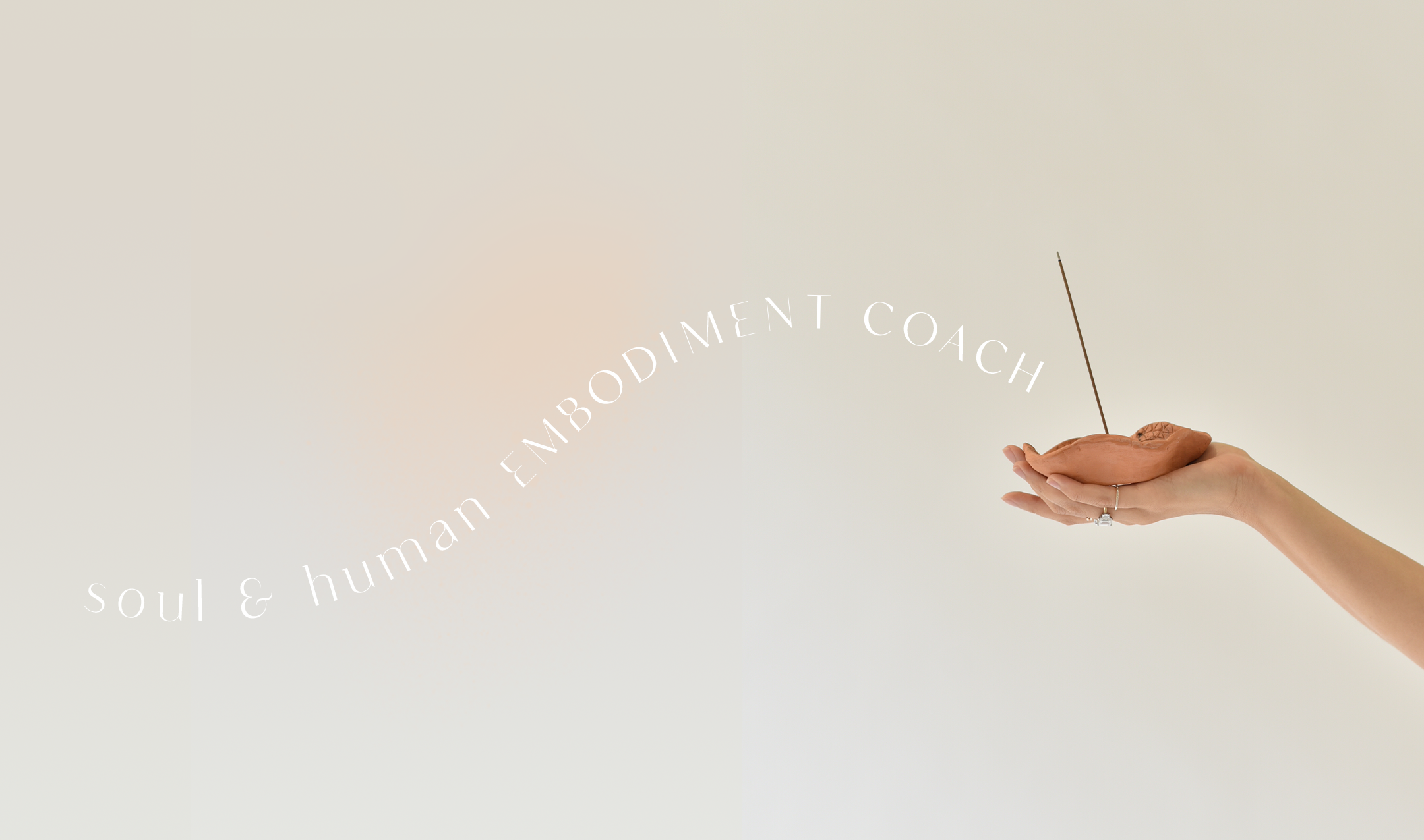
As a Hong Kong-based energy healer and meditation leader, the brand essence and style for Janith Chang is grounded in fluid simplicity. With a mixture of unique and modern typography, abstract and geometrical logo design, and etherial patterns, the entire look is as intentional as her offerings and practices. From the avant garde website layout to the ethereal imagery, all of the design elements allow her to stand out drastically amongst the competitors in her industry, all in an extremely aligned and authentic way.
CLIENT INDUSTRY: SPIRITUALITY + SELF-DEVELOPMENT
WEBSITE PLATFORM: SHOWIT


DESIGN NOTE
Janith wanted to embrace imperfection and exude that through her branding, which really challenged me to take my somewhat linear way of thinking and make it well, nonlinear. Coloring outside the lines. Because in her soul embodiment work, that’s really what it’s all about: embracing our imperfections and heal in whichever way one needs to. As a result, we combined fluid typography, a nontraditional layout throughout the website, and animations that literally make you stop and pause to take a breathe. Talk about soul embodiment.