Free People X Apothenne

THE OBJECTIVE
Hand-poured in Los Angeles, we had the honor of designing the Intention Candle Collection from Apothenne for Free People. Like every project but particularly this one, it was about creating a specific feeling. When someone uses this candle how do you want them to feel? And more importantly, how can the design reflect the scent? Using hand-painted watercolor pattern design, muted colors, and elevated typography, we were able to curate a design that represents each of the intentions in their true essence.
CLIENT INDUSTRY: HOME DECOR

DESIGN NOTE
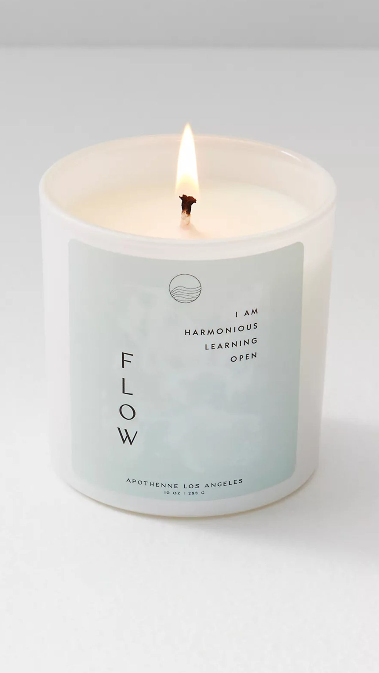
For FLOW - We chose a pale green/blue color since the chakra for this one is the throat (blue). The background pattern and symbol are wavy and fluid like water.
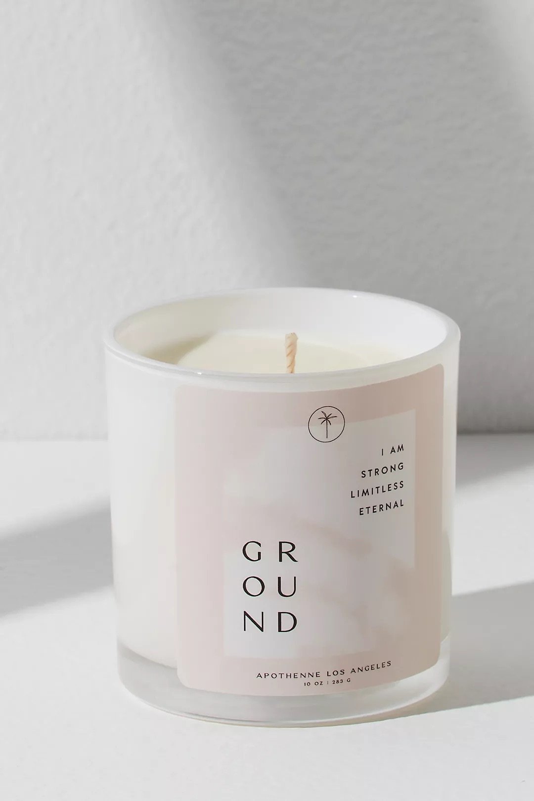
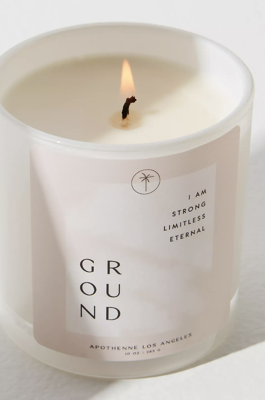
For GROUND - We chose a maude color since the chakra for this one is the root (red). The background pattern is more still than the others ones to give a calming, earthy feel. Hence the color and the palm tree symbol as well.
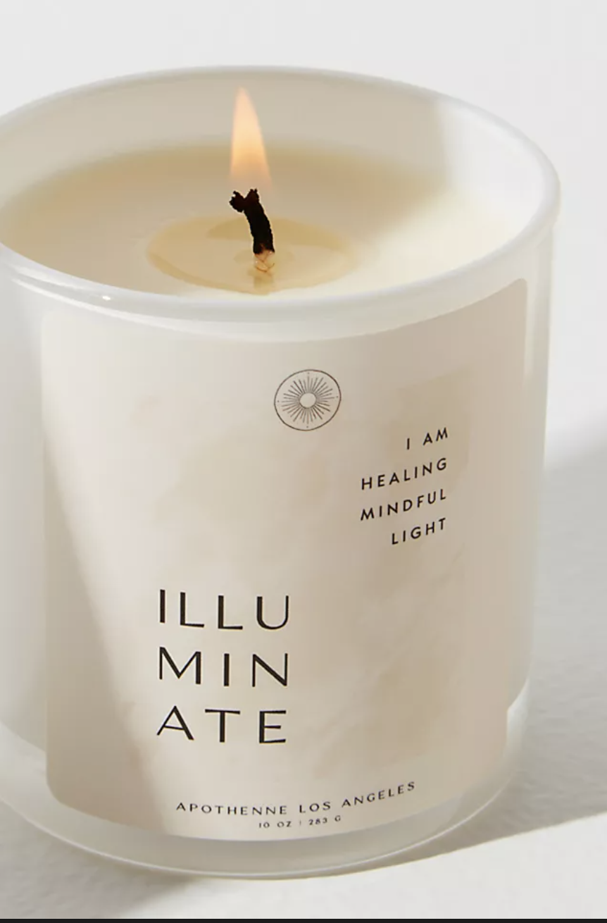
For ILLUMINATE - We chose a sort of yellow/gold/tan color since the chakra for this one is the solar plexus (yellow). The background pattern and sun symbol are more vivid of them all to represent the motivation, inspiration, and prosperity of the intention.
WATCH ME DESIGN THE CANDLES