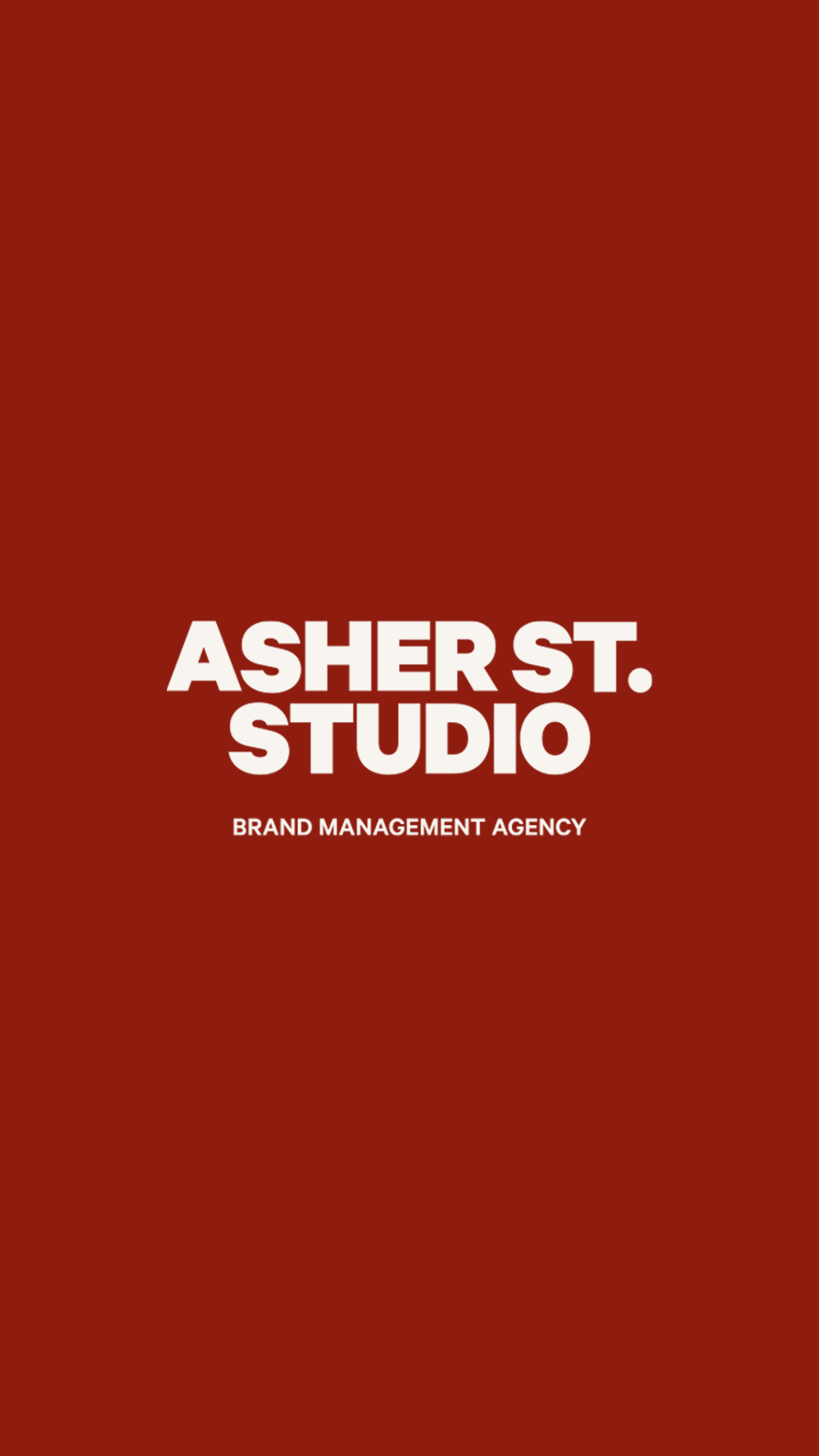
Asher St. Studio

THE OBJECTIVE
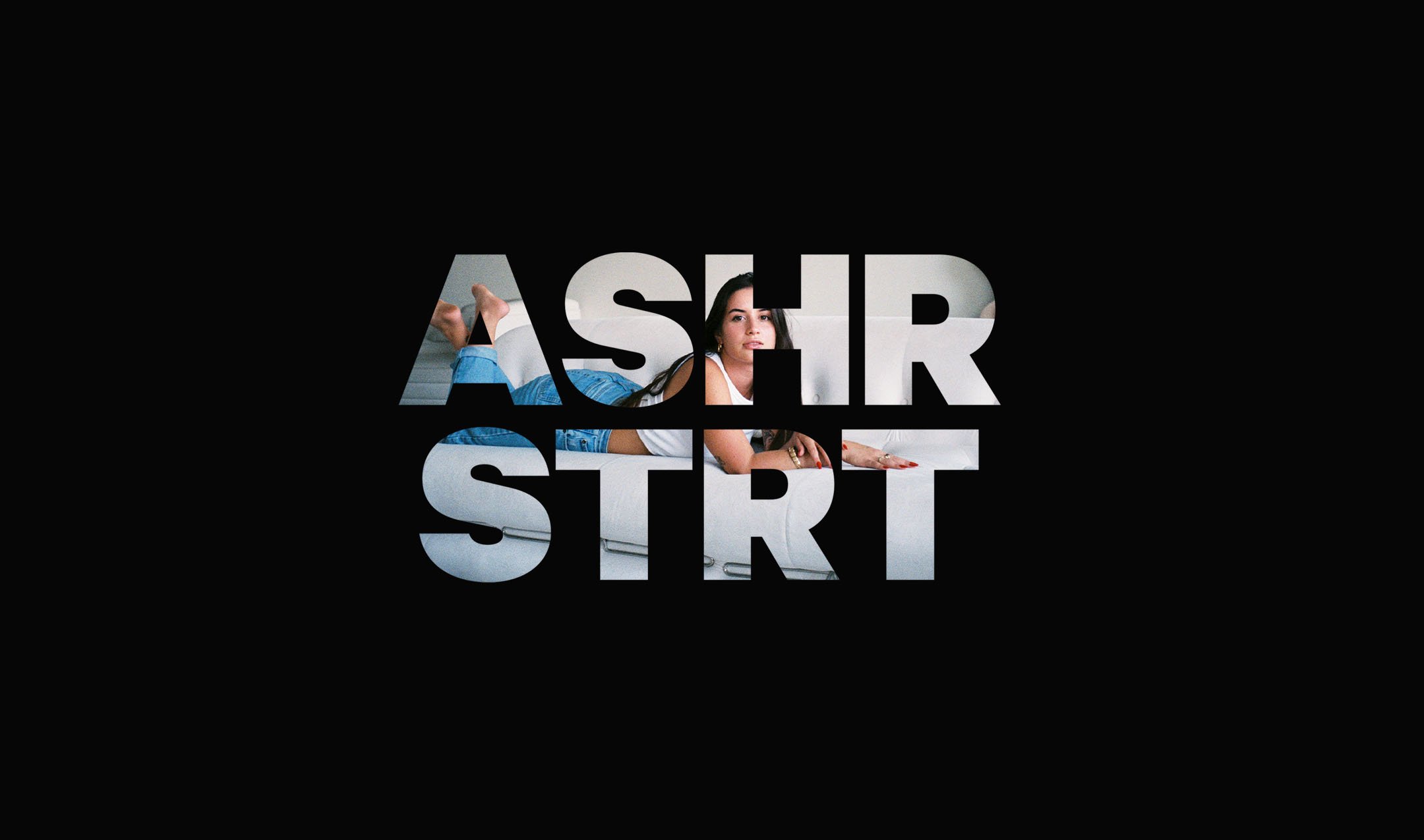
She’s the ultimate cali cool girl with all the strategy, vision, and edge. Basically, Asher St. Studio is the sh*t and so her branding had to match that bold energy. As a brand management agency, Asher St. Studio is anything, but average hence the usage of powerful colors, modern typography, and artistic typography. With this combination, as well as killer catchy copy by Ashten herself, the brand alludes of confidence, know-how, and creativity.
CLIENT INDUSTRY: BRAND MANAGEMENT + SOCIAL MEDIA


DESIGN NOTE
The “A ST.” Brand Mark is a fun play on a traditional street sign design, with the street name typically in a larger size text and the street abbreviation in a smaller size text raised. The reasoning behind this is to exude the creativity that Asher St. Studio has to offer. In addition, the combination of the primary and secondary typefaces creates a blend of old meets new, representing how she uses traditional and modern strategy to manage brands and clients.