CocoGlow Herbal
THE OBJECTIVE
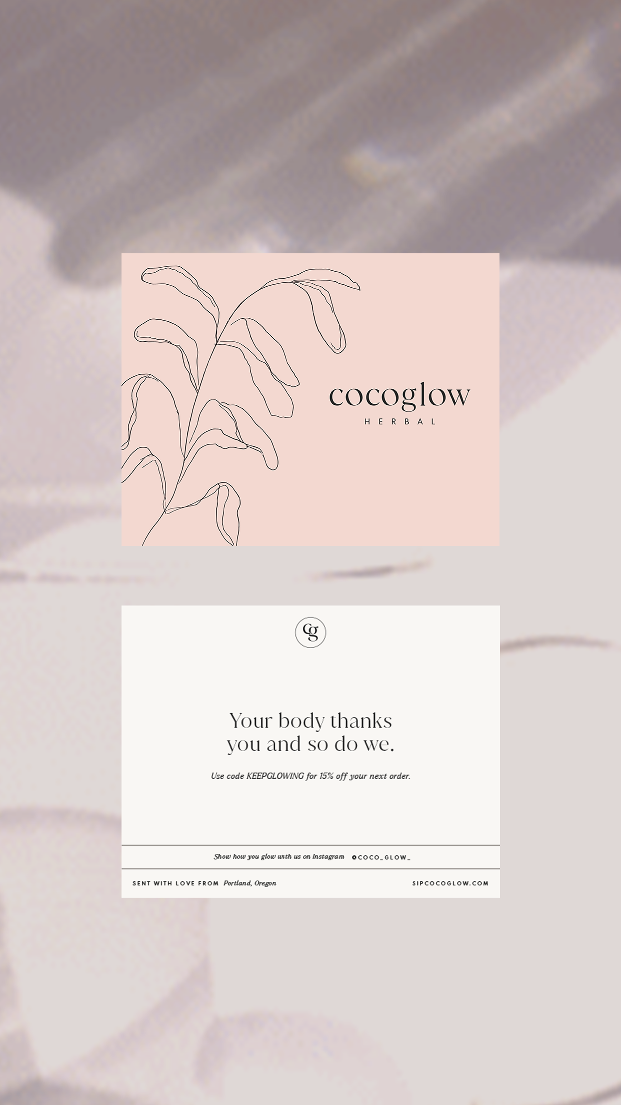
At the beginning of the project, Nicole and Emily, the founders of CocoGlow Herbal, came to us with a very intentional goal - to rebrand in a way that would translate and educate their holistic approach to wellness and their powerful ingredients to their customers.
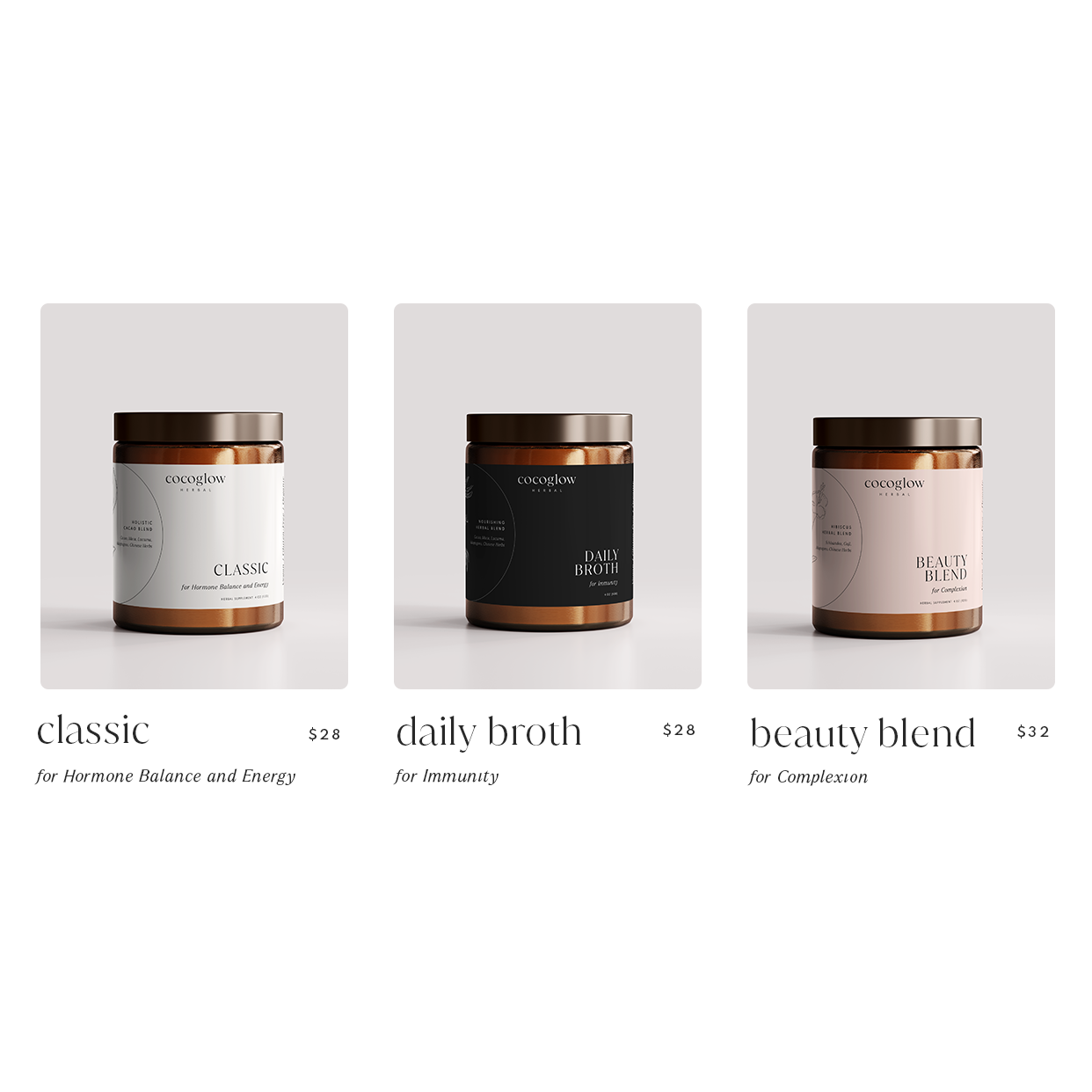
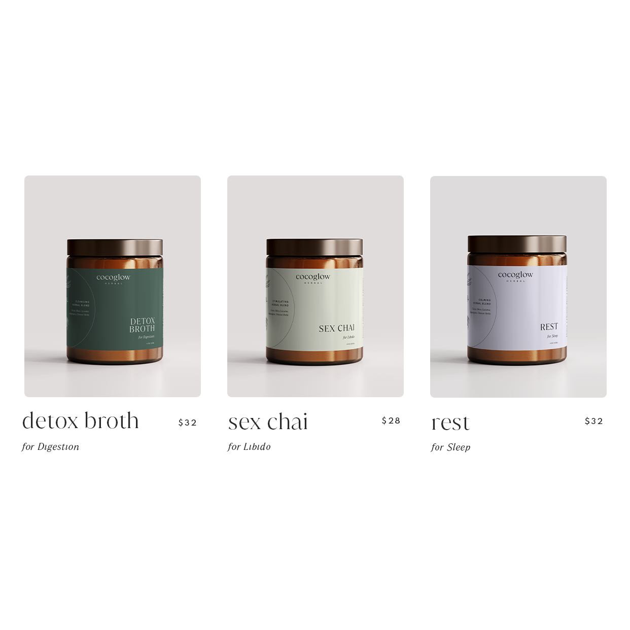
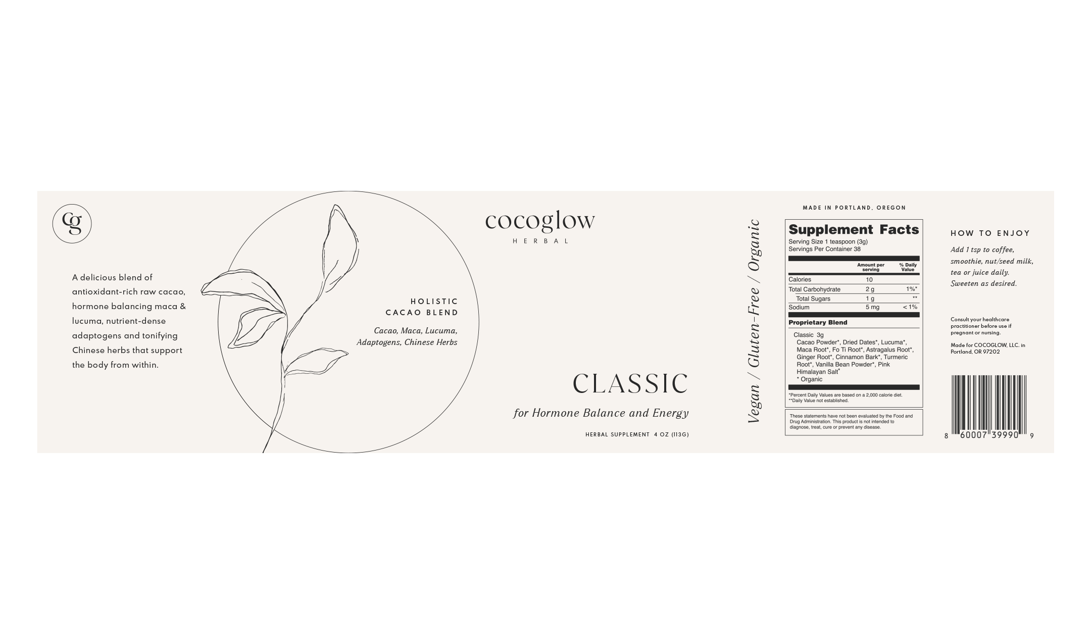
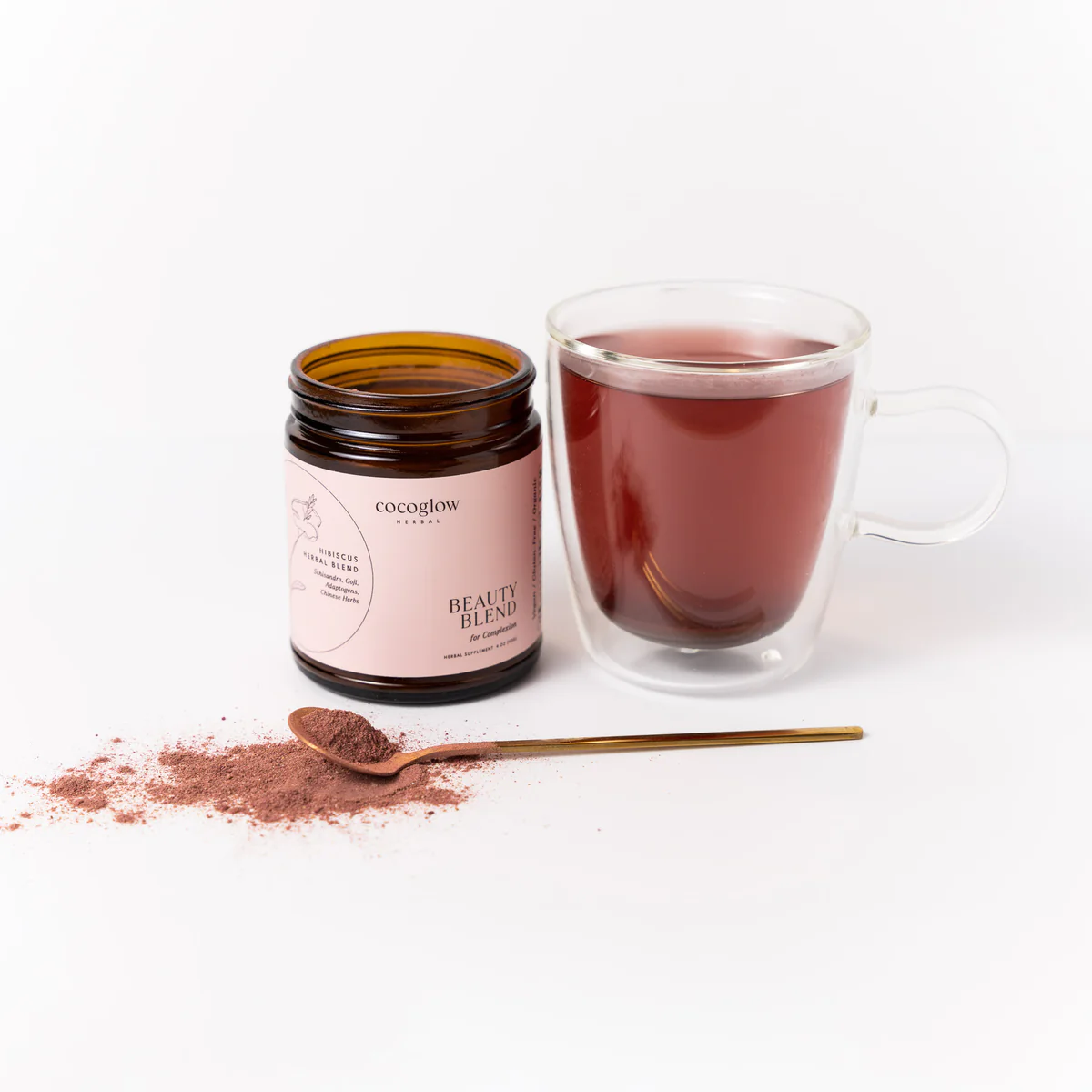
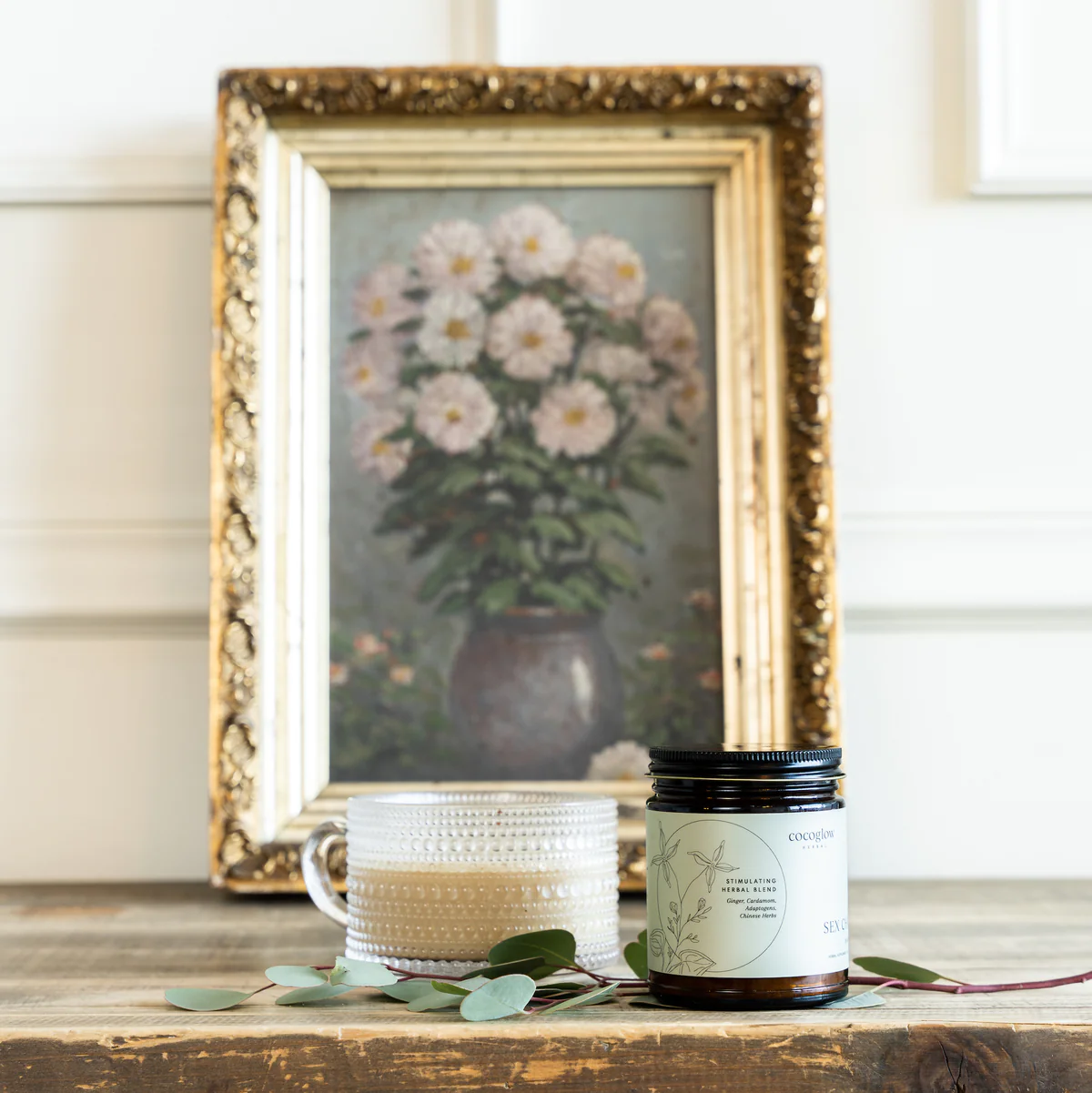
With that, we wanted to tell the story of each of their Herbal Blends not just through the descriptions and text on the packaging but the illustrations, shapes, and colors too. On each label, you’ll find a unique illustration of the ingredients in the blend and a color to differentiate what each blend is for - ie. pink = beauty blend, green = daily detox, etc. Lastly, the dynamic layout of the text with the shapes on the label makes it easier for the consumer to digest each piece of information (no pun intended), all while standing out on the shelves.
Overall, the brand essence we created for CocoGlow is both empowering and balanced, with grounded undertones of warmth and wisdom. Just like the products themselves.
CLIENT INDUSTRY: HERBALS + WELLNESS
DESIGN NOTE
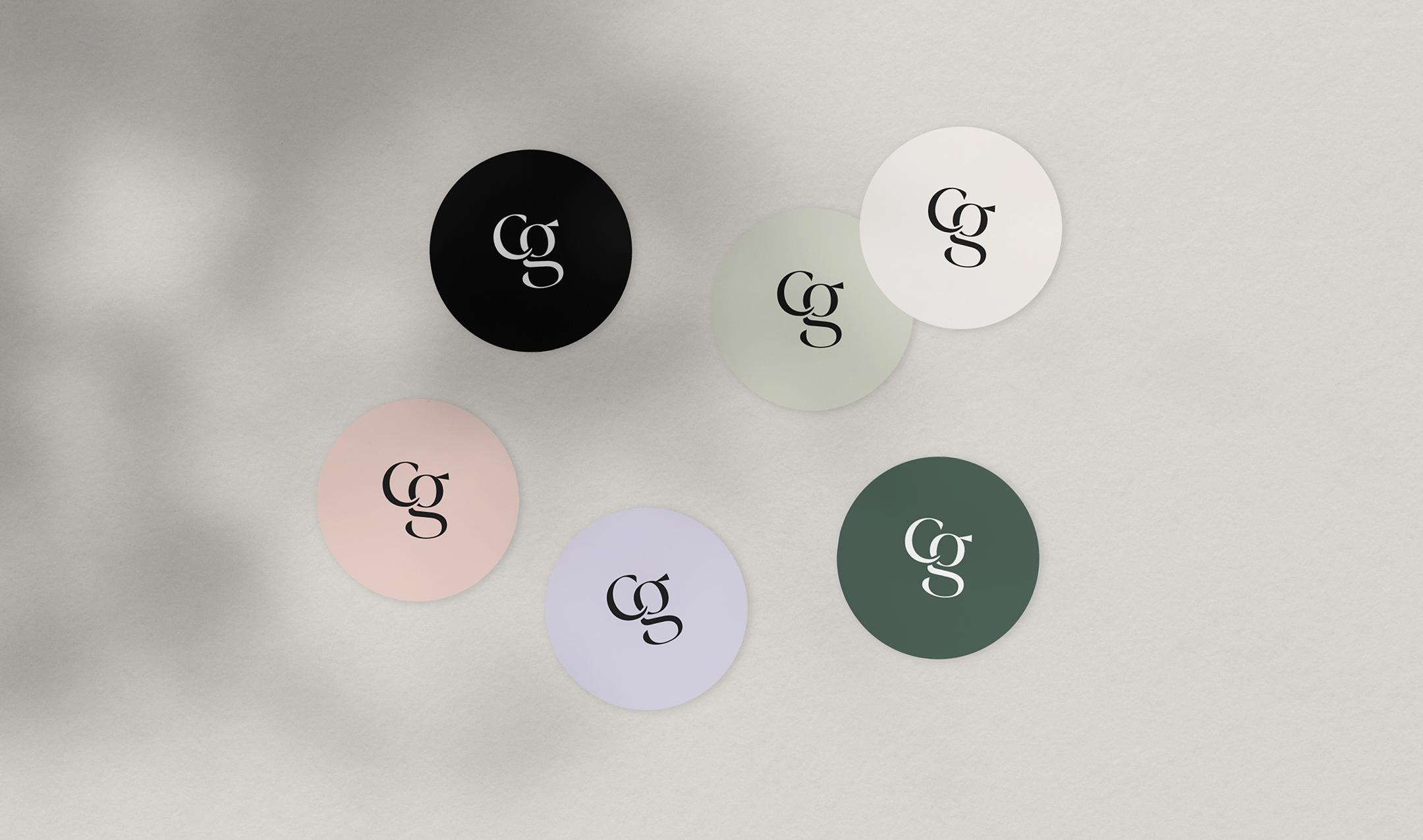
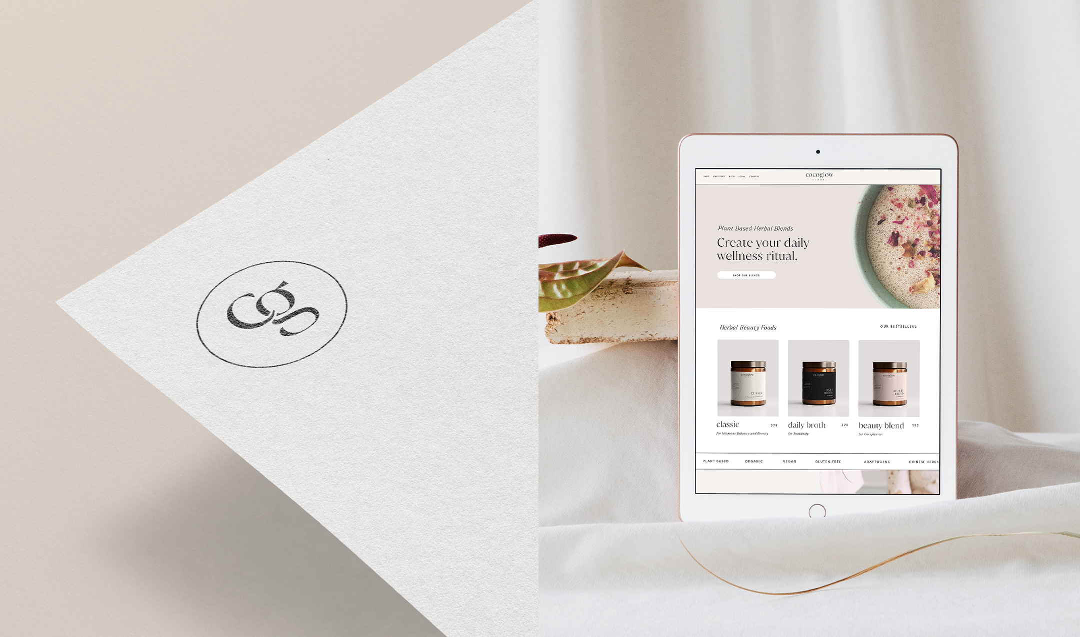
There’s more meaning to the “CG” brand mark than meets the eye. The merging of the lowercase C and G initials represents the symbiotic relationship of your plant-based herbal blends. That through their unique combinations and formulas, each one creates a specific wellness benefit that can transform one’s well-being from the inside out. All without being too on-the-nose. Lastly, the use of the circle in the brand mark is consistent with the circle used within the packaging, as a symbol of your holistic approach to wellness.


